


Lighting for the
Next Billion
#MakeEveryDayBrighter
About this project:
Ikea comes with issues such as Energy Saving, Convenience, Emotional Connect, Instant Gratification, and someone who was considering moving to the opposite side but was unsure. Someone who was risking everything for this one bulb. 
Team

Opportunity
Re-imagine the TRÅDFRI app with its current features and technology - UX, UI and motion.Timeline - 2 weeksRole
Ikea old website was functional, but not very user friendly. It was full of bugs, stylistically outdated, and inconsistent. I aimed to simplify and beautify the design, while improving the user flow of most tasks. As a big business owner, my client wanted to refresh the Ikea app look and improve their website. Design was modular, simple, and easy as per Ikea branding. And easy to handle without constant assistance of a developer. The designs are fairly basic and unembellished, yet elegant and inviting. Skills
Sketch, Illustrator, Invision, Zeplin, ExcelChallenge
Create a mobile app that enhances and "revolutionises" the IKEA Home smart app purchasing experience, as well as an illustration-heavy branding kit.

Our Journey
We started understanding the background of the Trådfri engagement from the available documents.We tested it and explored the app ourselves

Evaluated the app in detail from setup to customisation.
Research:
Conducted desk research, User Interviews and competitor reviewRead the online reviews - Website, youtube, app store, facebook and twitter.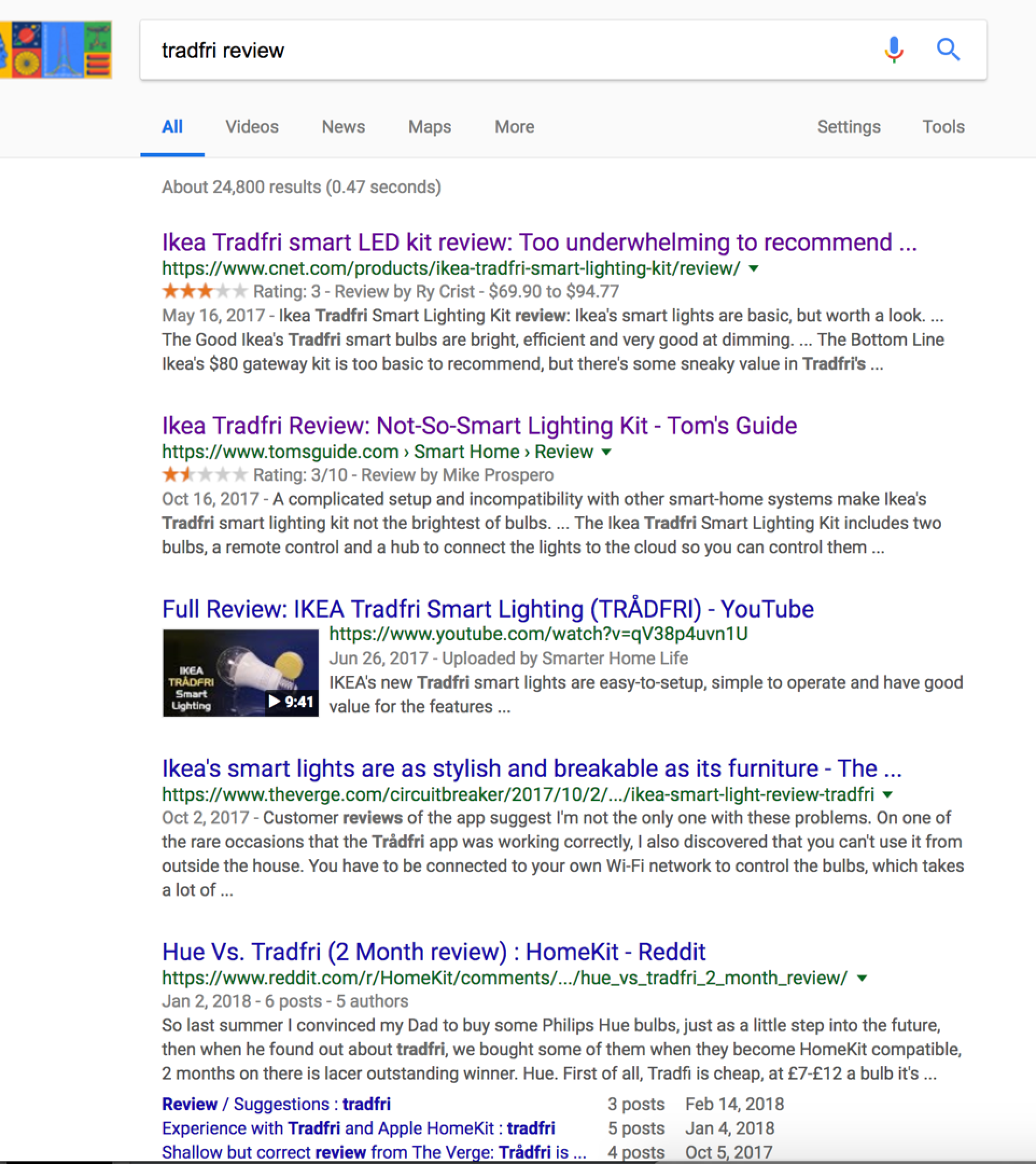
Online review - Google search results page
““Tradfri a score of 2.3/5. Philips hues as 4.3/5 It still isn’t comparable to the Phillips Hue on many accounts.””
““*March 2018 Update - We had to go through the installation process again with the Tradfri’s and it is just as awful as we remember it.””
““The frustrating process of installing the bulbs, three “custom” colors, and similar price points make the Philips Hue the clear winner in this comparison.””
Reviews from the android play store

Negative App review
“You can’t use it from outside the house. It means that you can’t open up the app to make sure that you turned off the lights before you left home”Chunky, No geofencing, No vacation mode, Old fashioned “Ikea’s smart lights are as stylish and breakable as its furniture”“Time consuming”“Painful experience. Connecting to the remote. Bringing up lights”“Works perfectly if you set it up once and never touch it again”“Intermittent connection between the gateway and other home assistance”“Runs for a week. Then you are forced to reset or redo it.”The list was never-ending…
Our Guiding Principles
What did we learn from conducting user interviews, conducting stakeholder workshops, and analyzing the competitor? -

Guiding
Users are hand-held at each step and are able to setup the lights easily.
-

Sense of Control
The directness and speed of the app makes users feel they are in control.
-

Tailored
Users should be able to personalize the app and set up moods easily

Ideation / Brainstormed with our team
The session was conducted in two parts. First part, we ideated around the smart lighting uses, ways to control them and asked to sketch a app concept.Second part, we gave the kit to set it up and explore the app.
We asked participants
What is your idea of a ‘Smart Light’?How do you wish to control these ‘Smart Lights’?If you had an app to control them, how should it be done?


Key takeaways for the assignment:
Helps in Energy Savings
Integrates well with other devices
Natural language/gesture-based
Intelligent behavior
Mood based lighting
Self diagnose
Easy Installation

Tested with people who never experienced a smart light

Testing the kit: It was given to the participants for testing including one gateway, one remote, and one bulb. We have tested it with 06 participants.
How we did
We asked them to perform the following set of tasks with the appInitial setup: Setting up the gatewayConnecting the remote to the gatewayAdding one bulb
App explorationDim/brighten the lightApply custom coloursApplying moods
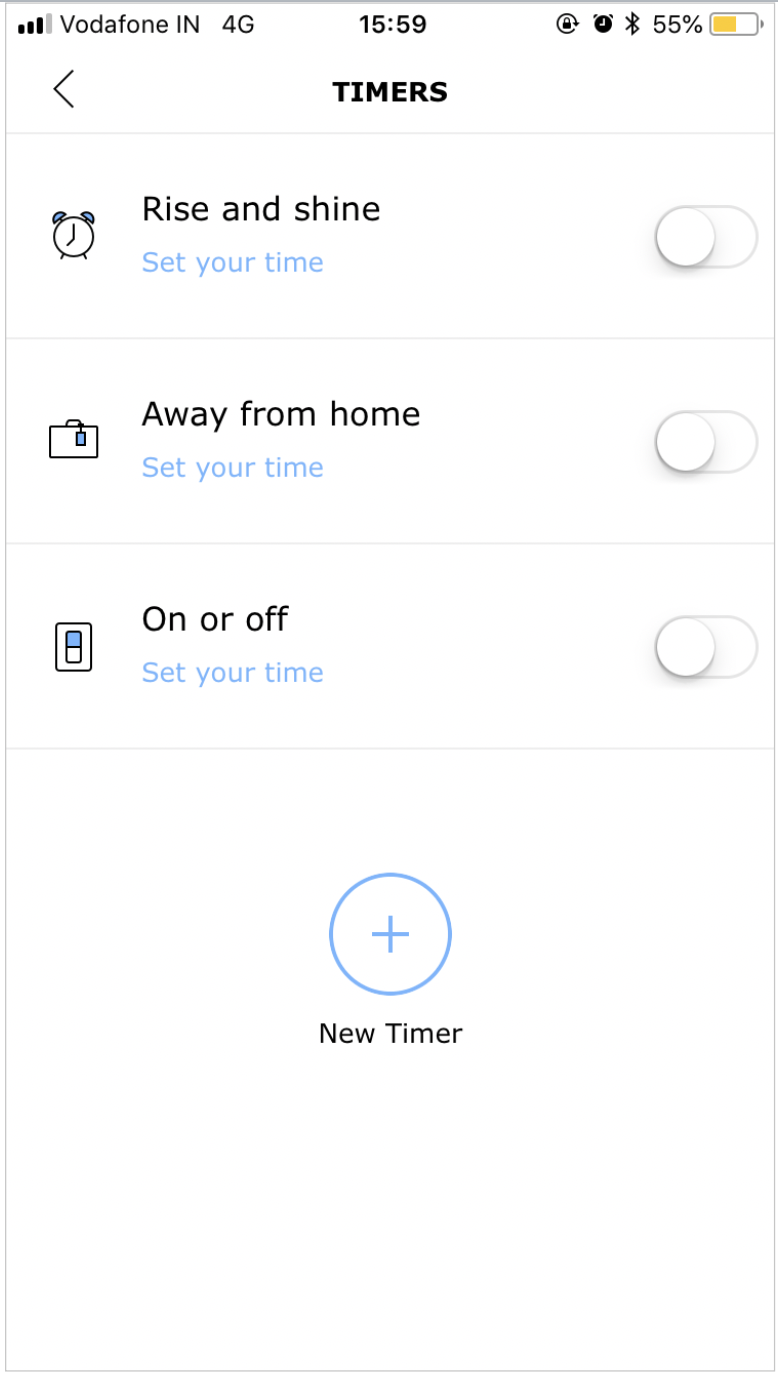
TimersSet a ON/OFF timerSet a rise and shine timer
Time taken to complete the given tasks:


Key Findings
The informative pop-ups are well received and clear to the participants.
Most of the participants were more comfortable controlling this style of brightness interaction over the slider.

Almost all of the participants like the idea of timers.
The challenging elements
The first step didn’t instruct to open the cap of the gateway before plugging in the cables.Instructions in the app are unclear and perceived as extensive.Failed to interpret the illustrations correctly.Confused between illustrations and interaction elements.Participants halted for seconds as the spinner with “Finding your device” confused them.Participants were unable to discover the other features once they land on the home screen.Almost none of the participants perceived the shaded circles as interaction elements, which is the only entry point to view the “Moods”.Participants misinterpreted the colour icon.

Some of the issues we found a match with the user testing findings conducted in August 2016.I just bought it. Why would I reset it?Moods Circle is not seen as an entry point to MoodsMixing up remote and gateway pairing buttonPeople often tried long pressIllustrations are hard to seeThe Colour icon was not initially noticed and understoodUnclear which screen the home screen isGroup off not obvious, but learnableMoods are initially perceived as colors for groupsProduct names beyond ‘TRÅDFRI’ are unknownStopped pressing the pairing button too early

Common blockers were identified from both expert evaluation and from participants.
Initial setup: Instructions in the app manuals are unclear, incorrect, and incompleteIllustrations in the app manuals are misinterpretedInstructions are perceived as too lengthy
App exploration:Unable to discover some key featuresInteraction elements are misinterpretedSome visual cues are misleading
TimersFew perceived the “Rise and shine” timer same as “On/Off” type of timer.
Prioritisation

User flows to focus for this assignment
Best scenario to leverage the motion design - App manuals used during the initial setup.


Entire app flow

Sitemap - Change Settings / Moods

What if you could give the user a perception of a quick and easy set up?

How might we create signature moments where users connect with TRÅDFRI at an emotional level?

The Reimagined App


Close Up
OPPORTUNITY AREA - SETUP Setup involves multiple steps which are hard to follow

In the current app
The communication of the instructions proved to be difficult to understand for everyone, however, the illustration were helpfulHaving multiple instructions on one screen leads to information overloadUser doesn’t get a holistic picture of the entire flow of setup, missing sense of control
PROPOSED DESIGN: We made Setup simple and easy to follow

Why does this design work?
The progress tracker shows users where they are in the processSteps are broken down in order to reduce cognitive overloadAnimations provide further clarity, especially since there are multiple devices involved in the setup
#GUIDING #FUNCTIONAL
OPPORTUNITY AREA - HOME SCREENThe current home screen, while clean and simple, doesn’t give the user a sense of control

In the current app
A simple, clean look & feel gives the app richness and we wanted to retain thatThe current home page doesn’t show all groups/rooms at a glanceIt leaves user feeling unsure about the hierarchy of information
PROPOSED DESIGNAll new home screen which keeps the app experiential while also giving users a sense of control

Why does this design work?
Overview of all rooms at once helps user make a quick decision on what to do next and keep track of which lights are on/offAbility to ‘switch off all lights’ helps user quickly turn on/off lights when entering/exiting the houseAbility to see how many hours each set of lights have been on, gives the user a sense of how much energy they are consuming and potentially become more energy conscious.Progressive disclosure of information enables better navigation
#SENSEOFCONTROL #FUNCTIONAL
OPPORTUNITY AREA - MOODSMoods - a missed signature moment in the current app

In the current app
The concept of moods is buried within the light groups and is, therefore, harder to discover and experiment withThe overall app experience is functional for key tasks but a feature such as ‘moods’ needs to appeal to the emotional level
PROPOSED DESIGNWe’ve surfaced the moods feature to bring about an emotional connect with the users

Why does this design work?
Discover moods is specifically designed to help users explore and be playful with theapp. This could well be crafted as a signature moment for the TRÅDFRI app experience• Default mode of the bulb allows the user to get back to the default state
#TAILORED #EMOTION
OPPORTUNITY AREA - ON-BOARDINGCurrently there’s not much a user can do until they complete the set up process

In the current app
It makes users quickly jump into the process of connecting their devices before viewing anything else on the appSince the set up process can be a bit daunting, there needs to be some glimpse of what the app is all about, in order for users to feel motivated through the set up process
PROPOSED DESIGNWe have designed an on-boarding experience which brings out the ‘why’ of this product

Why does this design work?
People have something interesting to see and learn prior to entering the process of set upThe tone of voice encourages users to go through the content and also gives them a motivation to go through the set-up and await what’s on the other sideAnimations help keep interest alive
#GUIDING #FUNCTIONAL
We Also Explored
Responsive design for tablet screen
Dark Theme


Recap

Behind The Scenes

Impact
We were effective in obtaining this client and bringing in more work for the design firm. Our designs were not only appreciated, but also implemented. Given the project's timing restrictions, I concentrated on the fundamentals.

I learnt to trust the research and discovery process while working on this project because I began with a totally different assumption and original thought on how to handle the problem. Finally, I needed to meet distinct user demands, which were not the user needs to dim, turn off, turn on, change colours, or go from warm to cold light, but the stages that counted in setting up this entire process. I learnt not to get too worked up about things.
I learnt not to be too hung up on the solution and to be open to new approaches to issue resolution. It's excellent to have broad ideas and inspirations; nevertheless, the process of concept growth may lead us far further.
Next Steps
Because design is never done, my next steps would be as follows: Create the remaining responsive application screens.Conduct usability testing on consumers in the target market.


