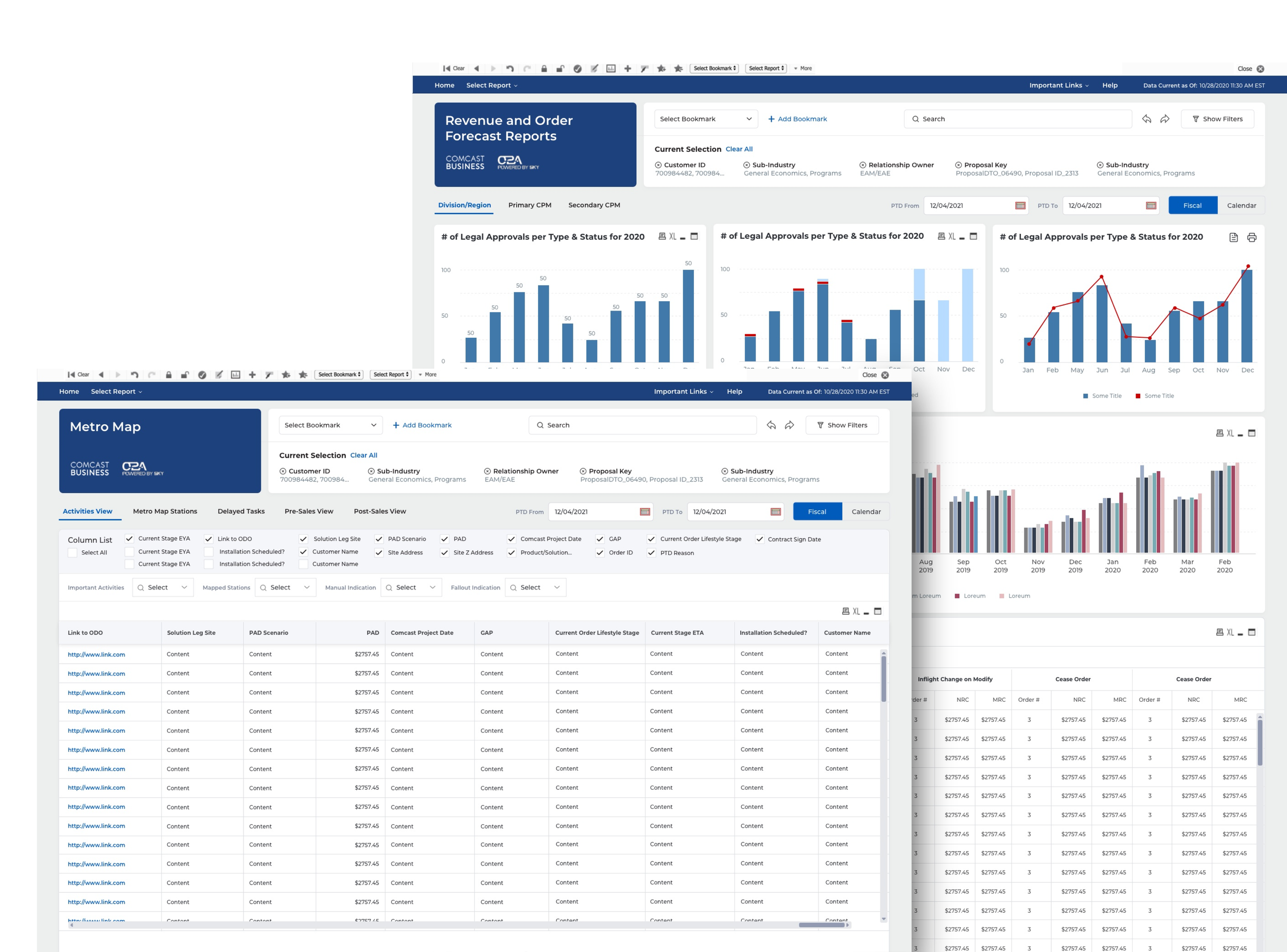
The new Sky reporting tool helps users get insight into their business operations and improve operational performance.
About this project:
-

1963
Selling Telco Solutions, Comcast quickly became the world's 2nd largest broadcasting & cable TV firm.
-

1990
Sky soon became Europe's largest media company and pay-TV broadcaster, selling to 23M+ subscribers.
-

2015
Comcast XDC engagement started with CPQ product inception. Engagement is strong and continues till today.
-

2018
Sky acquisition US media and telecoms conglomerate Comcast acquired Sky for $36 billion.
-

Today
Amdocs is working on SKY Reporting tool implementation for Comcast Business with their US-based team.

Team
Opportunity
Redesigned solutions to improve performance and productivityRadical UX/GD uplift, < 5 months, despite tech limitationsRole
As a Lead Designer, my goal was to create a design that was well organized, predictable and easy to scan. Tables and graphs visually distinct to create proper segregation. Overall usability uplift for all unique objects. To come up with a solution, I collaborated closely with the Interaction Team, Product owner, Product Manager, and key stakeholders.Skills
Sketch, Illustrator, Invision, Excel, PowerpointChallenge
Providing users better insight into their business operation and allowing them to improve their operational performance. Project Goal:
Why was the UX/UI uplift was required?Improve Performance: Provide visibility on the status of the Orders, risks to order completion, view tasks of their teams, view upcoming installations, view performance on several KPIs.Track KPIs: Provide valuable insights into their business operation through data visualization, help them and their teams to improve upon operational performance.Share Reports: Drill down to details e.g. why tasks taking a long time, where orders are getting stuck, extract summary reports and send them to the customer or management.

Our Methodology
Business needs analysis: Understanding business goals, defining the scope, understanding project limitations, identifying FPs and teams to collaborate with.User journey definition: Identifying the primary user group, investigating the current user journeys, pain points and identify areas of improvement.Tool study & Observations: Scheduling demos with developers, conducting workshops and walkthroughs with Sky technical team, to understand the current tool and design possibilities.

Discovery
We discovered the following through desk research: What were the constraints at the start of the project?No access to real users, their scenarios, or feedbackLimited scope, no deep dive into each reportTime and budget constraintsNecessary hands on exploration for every design changeAgile way of workingUnable to follow standard UX methodology
Business concerns
Limited Functionality: Built 4 yrs ago on QlikView –a BI tool that converts raw data into insights through data visualization. It has limited functionality.Poor User Experience: The existing UI is not intuitive or user-friendly. The UI components offer very little flexibility for editing and redesigning.Productivity Issues: Sky is introducing the tool to the majority of new users due to national expansion. May impact the adoption, training time, etc.

User groups
Who are the users?
-
CPMs, Operational Managers
Responsible for end to end customer order fulfilment
-
Regional Managers / Team leads
Perform specific tasks e.g. monitor team’s efficiency, upcoming tasks
-
Business Process Teams
Monitor the efficiency of work for other roles
-
Production Monitoring Teams
Check the health of the system
-
Sales Teams
View specific sales related reports
User Feedback
Persona creation and User Journey
Understanding goals, pain points, user journey…
Tool Study - The Process
Deep dive into how the tool works, the common flows, page level interactions, component level interactions etcIdentifying common components and understanding their functionality and reformatting possibilitiesIdentifying unique components that required deeper understanding in terms of data visualizationCreating a feasibility document to help understand the UI and functionality constraints for task-related requirements
Observations and Solutions
Common Components –Tables
Pain Areas
Visual Clutter: "The UI is quite cluttered, frenetic, and overpowering with really small text."Discoverable: “It’s not straightforward to understand what’s going on and where to find things”Lack of clarity: “The purpose of each report is not clear”Search/Discoverability: “It’s hard to figure out how and where to get the information they need”
Motivation
Get the information to address urgent issues which are blocking/riskingGet timely updates from the reports to help prioritize workCheck overall team/personal performance vs the important KPIImprove the overall team performance to meet their internal business KPIsImprove the service delivery to the customer overall
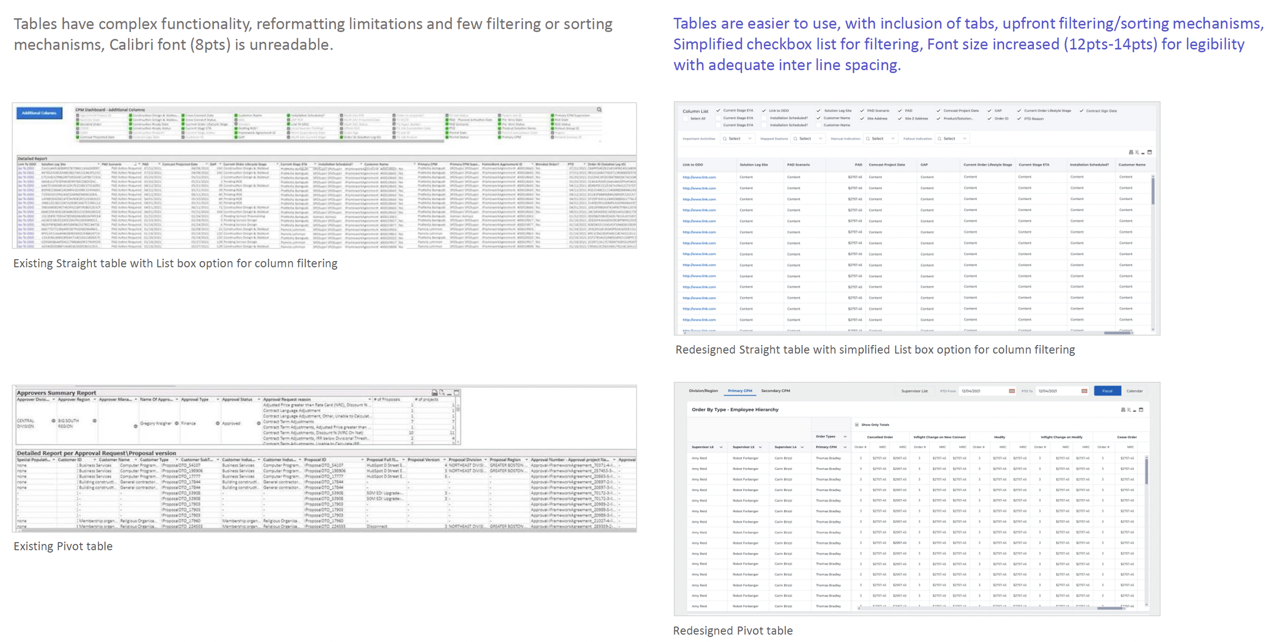
Tables have complex functionality, reformatting limitations and few filtering or sorting mechanisms, Calibri font (8pts) is unreadable.
Existing Straight table with List box option for column filtering
Existing Pivot table
Charts have muted, low contrast colors, difficult to decipher for users with vision disabilities such as color blindness. Existing charts: Simple horizontal bar graph, Simple vertical bar graph, Stacked bar graph, Complex bar graph with grouped bar charts
Specific components e.g.Orders Overview have complex data visualization, difficult to understand at a glance, status colors appear too dark or muted, data points are visually unclear.
Existing CPM Dashboard Overview
Main menu visually cluttered, includes too many Report tabs, important links missing, Sky and Comcast logos, Select Report, Search and Page Title visually inconspicuous
Elaborate, persistent filter panel, which is seldom used, has complex interaction. Selected filters are lost in the panel.
Important Bookmark feature, which is frequently used, is visually lost in Toolbar, difficult to find.
Absence of fixed width or grid, layout is not visually balanced or easily scannable, report/page title is lost, content hierarchy is missing, components look scattered without any visual alignment or consistency.
Existing Landing Page

Design solutions
Specific Screen Wireframes
Visual Design Handoff
Consistent, Scalable Design
For more check this Clickable Prototype
Impact
Radical UX/GD uplift, < 5 months, despite tech limitationsAddressed key concerns of the business and the usersRedesigned solutions to improve performance and productivityPositively impacted business metrics such as Customer Satisfaction, Adoption and Task CompletionReceived positive feedback and appreciation from stakeholdersIncreased performance and productivity by 29% in the first month of the launch
Future Opportunities
Understanding user needs and scenarios (deep dive)Understanding and redesigning specific reports like CPM Dashboard and Metro MapClubbing together Reports, repurposing of data on individual ReportsComplete revamp with Qliksensetool (higher version, offers greater flexibility)


